
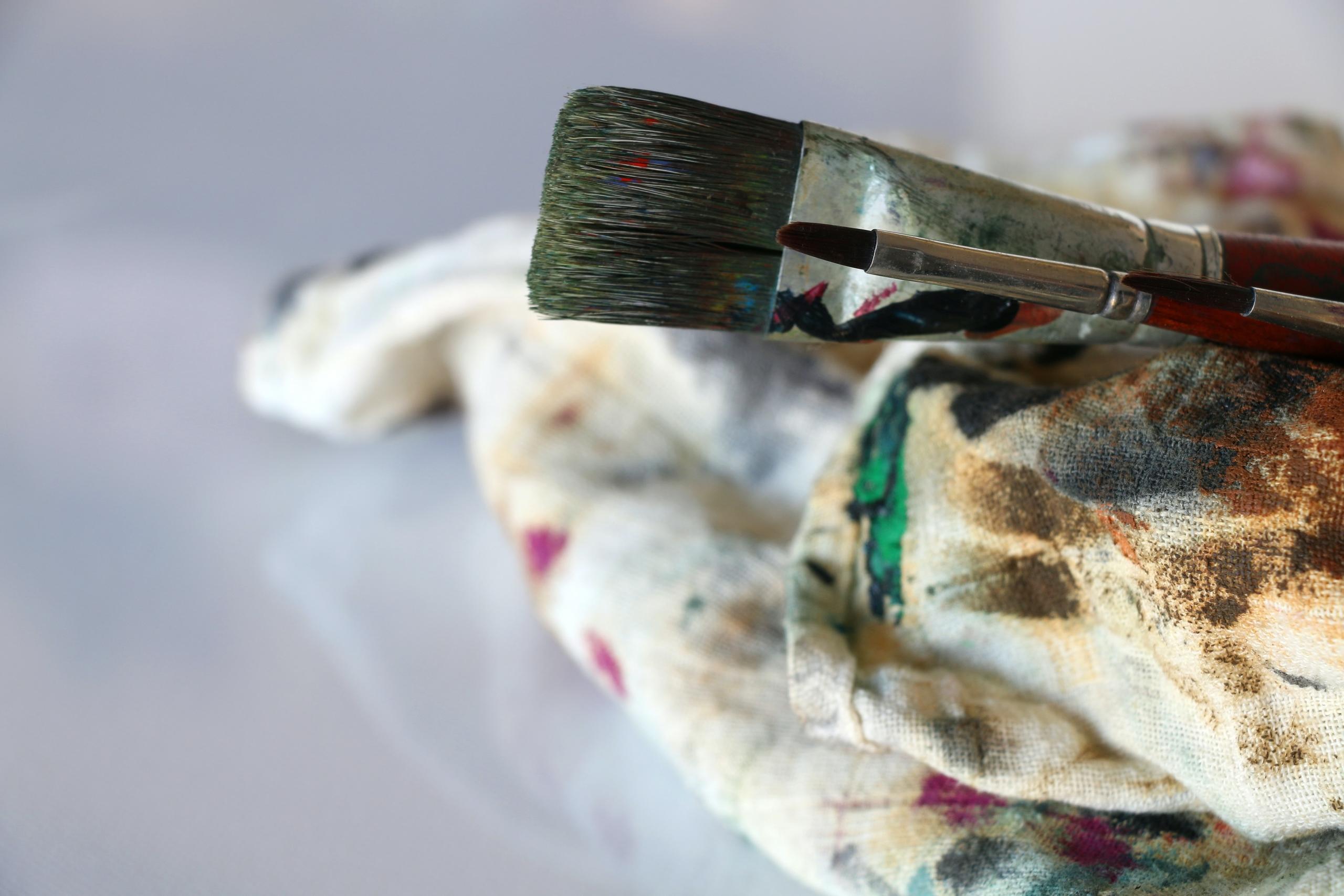
Visual Art gives you the confidence that you can manifest your own reality. You can create and zero in on developing your skills so that you can bring a mini world into life through your art pieces; create a visual exploration that takes the on looker on a journey of discovery. You can explore themes, pick your own theme and dive into the understanding of a variety of techniques and processes. This takes time and dedication but after learning from other art practitioners you will soon develop your own style as well as be inspired by other artists and their unique techniques and perspectives.
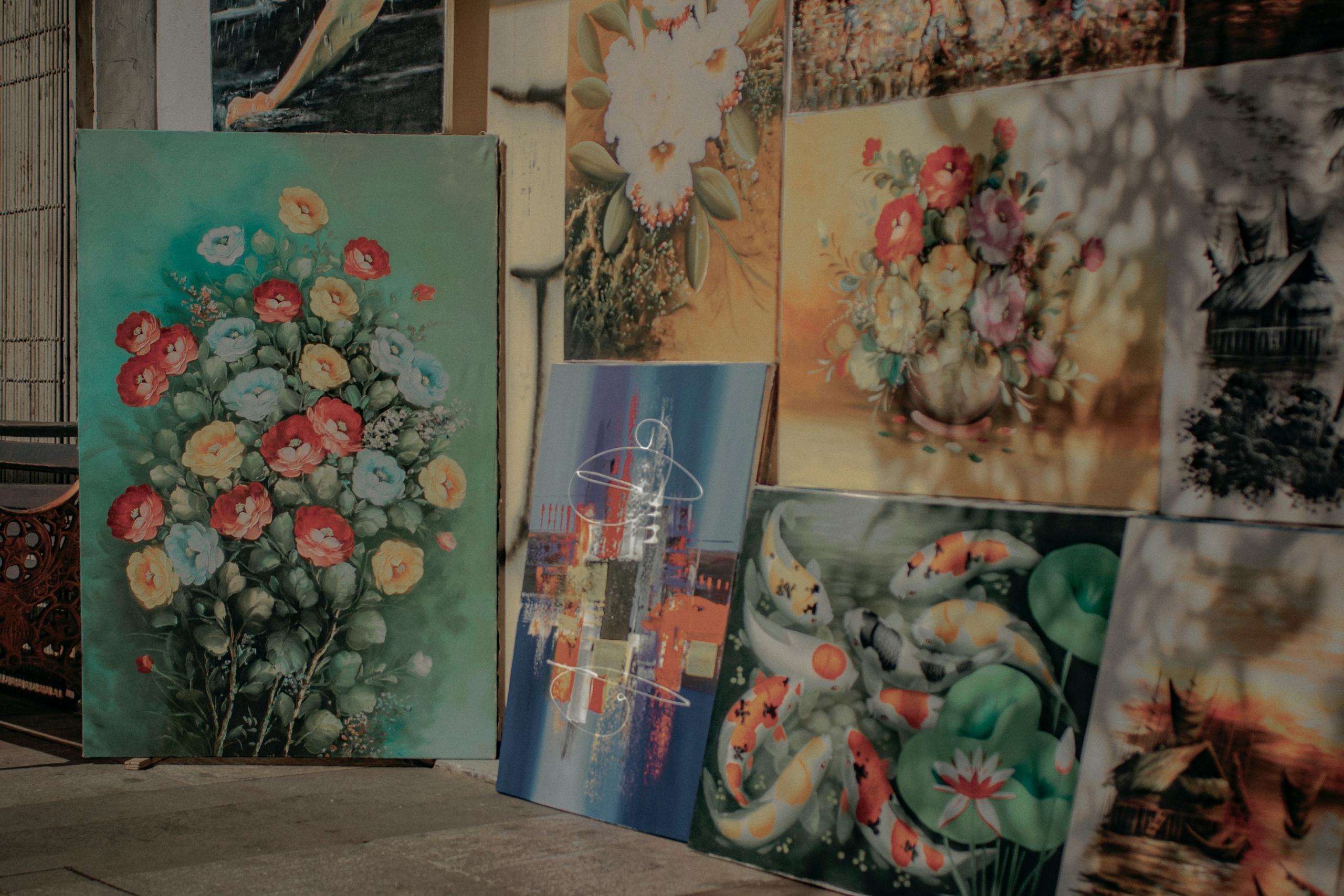
Throughout your NCEA Level 1 experience, you will be greeted with a variety of terms to get your head around and comprehend as they pertain to your coursework and your artboard. These include everything from Visual Art elements, principles right through to conventions. During the year in your Level 1 journey, you will be exposed to a wide range of art forms. These include drawing, painting, sculpturing, and printmaking. It will be up to your teacher and your school as to what forms you experiment with. Naturally, throughout the year you will develop an affinity for one or more of the mediums. For starters, let’s get into those unique terms that will come into play during your year. Familiarise yourself with elements, principles, and conventions and you will be on your way to getting those high marks you so desire.
If you are wanting to unpack a complete guide to your NCEA Level One year of Visual Arts then check this blog out here. Maybe you would like to see a spotlight on the Internals that you will do during the year? Perhaps you are stuck on some typical Visual Arts topics and are needing some guidance? Or if you want to see how taking NCEA Visual Arts can help your future career check this blog out.
Elements are all about what tools you have in your arsenal.
Do you have a full kit of unique objects to mold your drawing or sculpture into something truly destinctive? One of the key concepts to get acquainted with is the elements of Line. Line is the path created when an object moves from one point to another. They can be horizontal, vertical, or diagonal depending on the medium, artist, and artwork. A line can be both two or three dimensional and very defined or leaning towards more abstract sensibilities. The type of line can be thick, thin, free form, vast or narrow as well as light or dark. Think of Van Gogh and how his lines are more dashed, separated and distinctively defined. On the other hand, different artists use a more traditional line structure. Lines can even be implied in more abstract forms of art like impressionism. This is where you can discern basics shapes, but the figures depicted are not super clear.
Next up, we have the element of Shape. This occurs when the beginning of a line intersects with another line, creating a shape. Shapes in Visual Art are two dimensional. There is a vast amount of shapes, but they can be categorized into geometric or organic. Geometric shapes are hexagons, squares and rectangles. Organic shapes are free form and unique to what an artist sees.
Another vital element is Form. This is when a shape gets a third dimension of depth. If you wanted to make a circle have form, you would make it into a sphere, a square would morph into a cube, and a triangle would transform into a cone or pyramid. Form can be implied or shown in a real way. For instance, with sculpture, form is real as it takes up three-dimensional space. Whereas in a painting, you can only create the illusion of form. For example, if you were depicting the signs popping out on your busy street, light and shadow is used to enhance and diminish the element of form. By extension contrast also creates highlights and shadows. For example, you could utilize colour to show form, using heavy neon to make your shapes. However, you will then have it set on a mundane, lacklustre concrete wall. In short, form is the ultimate way to fool viewers by the piece is put together and how their choices are made.
Often when we think of art, we think about only how something looks. But there’s an element that plays with a strong sense that is often overlooked. This is our sense of touch. A great deal of thought can go into a ceramic or bookmakers texture of their art piece. In the same way, you can use texture to enhance the experience of your own work. This has the ability to take you to the next level of engagement with your art if done well. The texture sums up the look or feel of a surface. Like form, texture can be real or implied. Actual textures could be collage usage for your end of year board. Or, you can create implied texture by drawing stubble on a self-portrait.
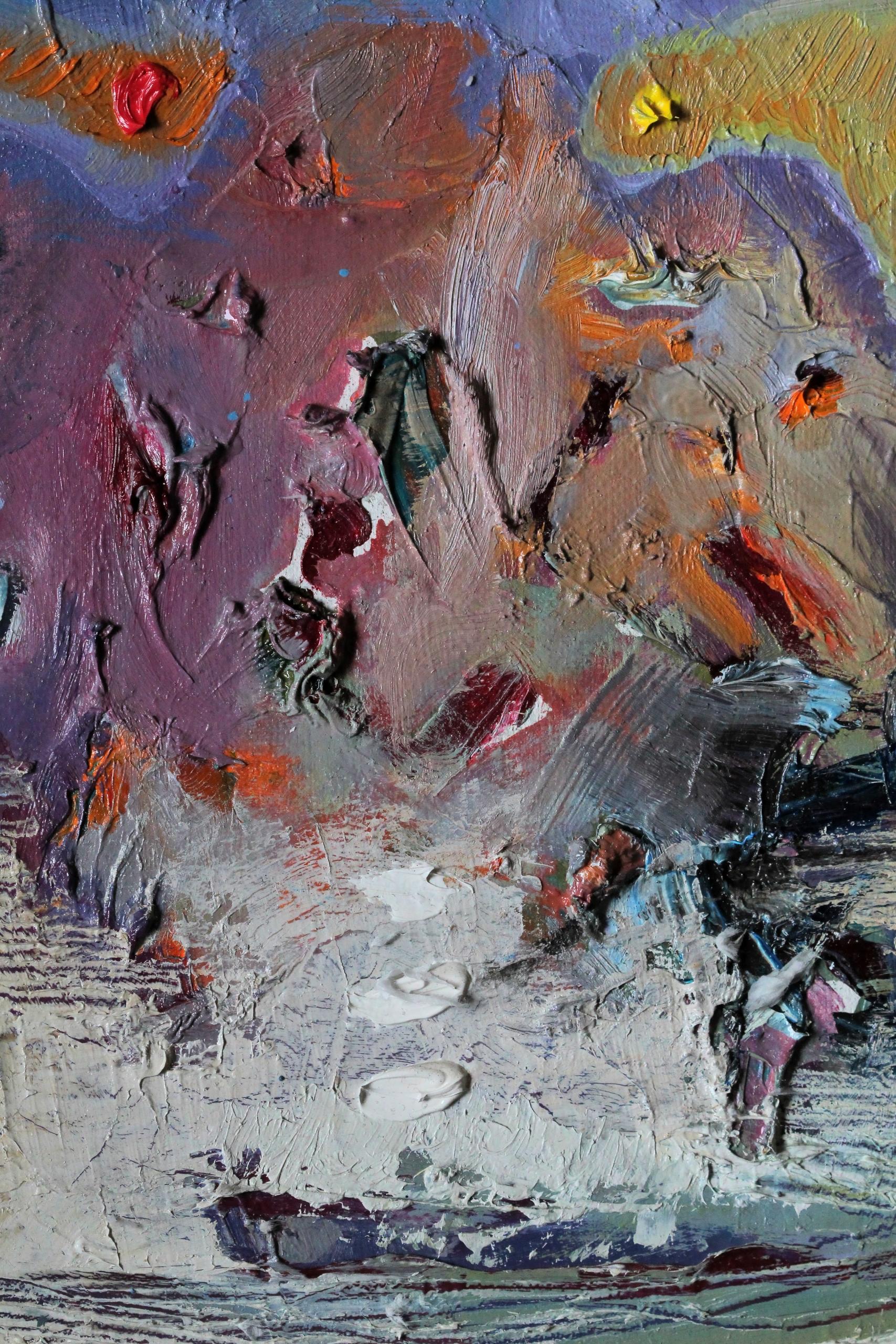
Then we have the element of Value, which is how light or dark a colour is. These are best understood within a scale of hues, from dark to light. Values are made by adding light or by darkening with black. Having a high contrast image would have several tonal points between black and white. While some photographs have an array of greys, lines and textures interact with value as well.
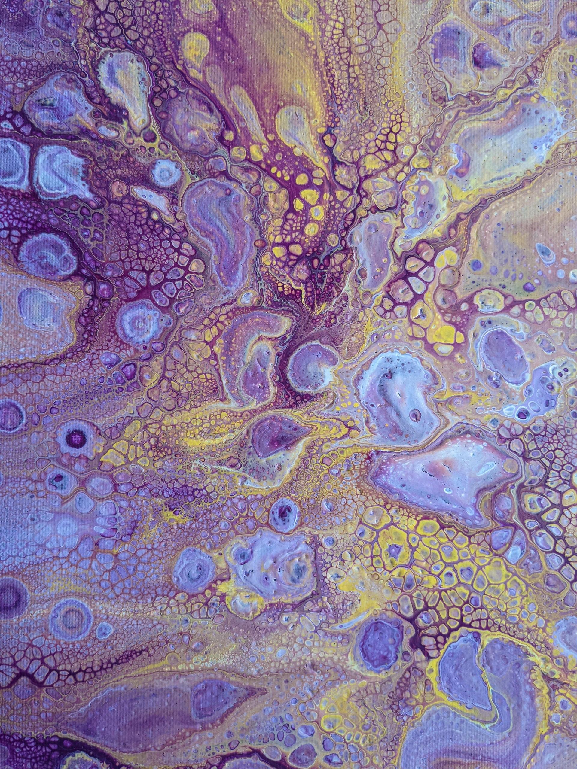
It’s now time for Colour. You may choose to include some of your work in black and white or you may want to showcase rich colour. When light hits an object, it can either be absorbed or reflected depending on what the object is made of structurally and material wise. Light reflected off an object is what we call colour. As you might know, red, yellow and blue are primary colors as they can’t be made by mixing. But when you mix them all together you can create hues from crimson right through to charcoal.
Finally, the last element is Space. This is the area in which an artwork is structured and organized. It can encompass the area within an art piece or outside of it. For example, regarding your end of year artboards, you will be working with space not only within each individual piece but also the board itself. In the sculpture medium, positive space is the space where the main objects occupy your attention. On the other hand, grass or hill shape would be the negative space.
Principles are the next concept to tackle with.
These are the way that we use elements altogether. It’s all about the methods taken to achieve certain looks and feels. For example, Balance is all about the appearance of weight which is informed by colour, texture, and space usage. It’s all about how stable the art piece feels. If you want to add weight to an object, having a bright colour and dark value will achieve this. An easier way of looking at this would be determining whether the art piece is symmetrical or asymmetrical?
The Harmony principle focuses on using a few elements to create a sense of similarity in the work of seemingly separate parts. Rhythm concentrates on creating a visual tempo illusion of movement through colour, shapes and lines. This is where patterns are made from images and lines. As we know, Van Gogh created paintings rich in colour, using very bold and strong colour hue choices. But he also had the effect of rhythm when he used thick, expressive brushstrokes. This shows a visual tempo where the artist takes the viewer on a journey with their eyes.
Tension as a principle is all about using line, shape or colour to show an imbalance in an art piece. You could also use thematic tension like health verses sickness as a theme. You could depict a nurse next to someone who has just passed away. It’s all about how chaos has eventuated from the contrast of elements.
Tension also links in well with Contrast. This is the opposite of harmony. This demonstrates the arrangement of opposite elements to showcase your meaning of the art piece. Contrast can be anything from light to dark colour choices, right through to soft and hard textures on a sculpture. It’s the opposing struggle of the elements in their direct contrast that draws attention to what the artist's focus is.


Get ahead with Superprof!
If you are wanting some extra help with nailing these terms and practising these as well in your own work: try Superprof. This is an online tutoring website that has a whole range of tutors to help get you to the next level of your art journey. If you need extra resources, guidance or support, maybe even just some extra tips at navigating the year ahead, give Superprof a go. Log on today, your first lesson is free as well.
Enjoyed this article? Leave a rating!


